Case study
Buddy Run
A running coach that guides by rhythm instead of telling you to speed up.
Prototype
Three minutes through the app: intake, baseline run, sprint, and the live run screen.
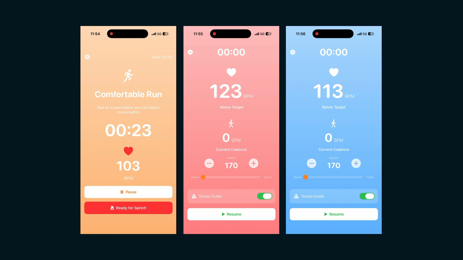
- The whole screen is the readout. Background colour carries the heart-rate zone, so the state is legible at a glance mid-stride rather than needing a number read off a chart.
- The zone is named in words — Above Target, Below Target, run at a pace where you can hold a conversation — because a runner at effort has no attention spare for arithmetic.
- Target cadence has plus and minus controls and the tempo guide has an off switch. The algorithm proposes; the runner decides.
Case study
A running coach that guides by rhythm instead of telling you to speed up — an iPhone app that reads live heart rate from a Whoop strap and answers with a tempo you can match your steps to.
Three-person team · Biometrics of Design (GSND6340), Northeastern · Fall 2025, presented 8 December 2025 · iPhone, Whoop
The problem
Every running app has the same conversation with you. It shows a number — 148 bpm, 164 spm — and leaves you to work out, mid-stride and out of breath, whether that number is good and what to do about it. The ones that go further talk at you: speed up, slow down.
Both put the runner in the position of interpreting data about their own body from the outside. The design question was whether biometric feedback could arrive through the same channel as the running itself, so that correcting your pace feels less like following an instruction and more like falling into step with something.
Constraints
- Optical heart-rate sensors lag. The Whoop strap broadcast every five seconds, and during a rapid change in effort the reading trailed reality by five to fifteen seconds. Anything driven moment-to-moment by heart rate would be coaching the runner’s recent past.
- A phone in your hand, at speed. Whatever the screen said had to be readable in a glance, by someone breathing hard and moving.
- One course term, three people, and hardware we did not control.
- Safety is prescriptive here. Cadence changes have to stay inside the range the biomechanics literature supports, which caps how fast the app is allowed to push anyone.
What informed the design
- Nacke et al. (2010) on direct versus indirect physiological control. Their finding that intuitive sensor-to-action mappings produce more enjoyment is the reason feedback became rhythmic rather than verbal.
- Mueller et al. (2011), Jogging over a distance, on audio creating a sense of running alongside someone who isn’t there. That became the model for what the app’s guidance should feel like.
- Consolvo et al. (2009) on behaviour change: reward the desired behaviour without punishing lapses, and let people modify what’s tracked. Both show up directly — the coaching is encouraging rather than corrective, and the runner can override the target.
- Heiderscheit et al. (2011) on cadence and joint loading: increases of five to ten per cent reduce loading, and progression should not exceed five per cent. That is a hard ceiling in the logic, not a guideline.
What I rejected
Heart rate as the real-time signal. The obvious design, and the sensor killed it. With a five-to-fifteen second lag, a runner who surged would be told to ease off once they had already eased off. Heart rate moved to a context role — setting zones and personalising targets between runs — and cadence took over the moment-to-moment work, because cadence is the one thing a runner can change on command and it registers instantly.
Voice coaching. “Speed up” and “slow down” were in the first concept and came out. A voice makes the app an authority you obey; a tempo is something you fall into step with. The replacement is haptic vibration and an audio metronome at the target cadence.
A universal cadence target. The received wisdom is 170–180 steps per minute for everyone. We tested zone by zone instead, because the right cadence at an easy pace is not the right cadence at threshold.
Generic max-heart-rate formulas. There are several in circulation — 220 minus age, 208 minus 0.7×age, 207 minus 0.7×age — and they disagree with each other and with people. One team member’s measured maximum was 175 against a formula estimate near 190. A 15 bpm error is the difference between a hard effort and an unsustainable one, so max heart rate is measured with a sprint rather than assumed.
Key design decisions
The whole screen is the readout. Rather than a number to interpret, the background colour is the heart-rate zone — warm amber for an easy effort, red for a sprint, blue when you are under target. State is legible in the half-second you can spare. The number is still there for anyone who wants it, but you do not have to read it to know where you are.
Words instead of arithmetic. The screen says Above Target and Below Target, and the easy-run prompt is run at a pace where you can hold a conversation. A runner at effort has no attention spare for maths, and a conversational pace is a thing you can feel without a device confirming it.
The algorithm proposes, the runner decides. Target cadence has plus and minus controls, and the tempo guide has an off switch. This is Consolvo’s “controllable” strategy taken literally: a coaching system that cannot be overruled is one people stop trusting the first time it is wrong about them.
Data consent as a product decision, not a policy page. The proposal set out three ways to use the app: pay and your data stays private; share anonymised data and use it free; or accept ads and your data still stays private. Privacy is not the reward for paying — it is available on every tier, and the choice is changeable at any time. Health data is the most intimate thing a fitness app holds, and making its handling a thing the user picks rather than a thing they accept is the whole difference.
Designed, then narrowed
Two artifacts came out of this project and they do not match, which is the most useful thing about them.
The final interface design, by Yunbing Han, is the whole product: a baseline-run explainer that promises to find “the cadence that feels like yours”, a weekly plan whose focus notes read enjoy the “could keep going” feeling and don’t speed up or go farther just because you feel good, a run calendar, and the buddy — a character on the primary button, a Buddy tab, friends, and locked achievements. The behaviour-change reading is visible in the copy: it rewards restraint rather than effort, which is the opposite of what most running apps do.
The build is narrower and darker. It reads live from the Whoop strap, gates personalised runs behind “Complete Baseline First”, tracks a weekly streak, and runs the live coaching screen. The buddy is not in it. Neither are friends, achievements, or the planner.
That gap is not a failure of the design; it is what one term buys. But it does mean the honest claim is narrow: what was validated on a device is the biometric loop and the live coaching, and what remains a design is the companion and the social layer around it.
Outcome
The study we designed is not the study we ran, and the gap is the honest part.
The plan was three experienced runners, aged 18 to 55 and uninjured: a five-minute baseline calibration run, then intervention runs across heart-rate zones one to five, cadence adherence and pacing consistency measured against personalised targets, a post-run survey covering perceived exertion and how intrusive the feedback felt, and a 30 to 45 minute semi-structured interview each.
What happened instead was autoethnographic — a single participant, us, across multiple run conditions — because of time constraints and Whoop functionality problems. That is a real limitation and it bounds what the project can claim: we have a working prototype and a protocol, and no evidence yet about how the feedback lands for anyone who did not build it.
What the runs did establish is narrower and still useful. Measured maximum heart rate diverged from every formula estimate by enough to matter. Baseline cadence varied enough between conditions that a single target would have been wrong most of the time. And the sensor lag was consistent enough to design around rather than a fluke.
What I’d change
Get it off the phone. The most obvious flaw is that the coaching lives on a screen you have to hold and look at, while the thing it’s coaching is your legs. On-watch feedback — haptics at the wrist, no screen at all — is the version of this that makes sense, and it would make the glanceable-colour work mostly unnecessary.
Run the study I designed. The protocol is sound and it was written before the term ran out. Three runners with the existing prototype would tell us whether rhythmic guidance actually beats being told to speed up, which is the project’s central claim and currently its least evidenced one.
Push past cadence. Cadence was chosen because it is instantly controllable, which was the right call. Breath rate is the next candidate: slower to move, but closer to how hard something actually feels.
Documents
- Heart-rate integration proposal The earliest document, written by me: the AI buddy, HRV trends, and the three data-consent models.
- Method plan The protocol we designed, against which the autoethnographic fallback should be read.
- Final presentation The deck as presented, including what the study actually became.